[caption id="" align="aligncenter" width="600" caption="The view from these parts"] [/caption]
This gorgeous Naples home belongs to my in-laws, the "serial remodelers" as my husband likes to refer to them. Just over two years ago they sold their sprawling home in Rolling Hills and bought a retro modern home in Naples. With all 5 kids off to college and out of the house they opted for a smaller home in a more social neighborhood. When they first bought the house I really thought I liked it, now looking at the before photos I'm not as sure. One thing I know for sure the finished (well almost) house is stunning. There is still some decorating to complete, an indoor fountain to get built, and a few other finishing touches to be finalized.
Prior to the remodel the kitchen, dining room, and main living area were upstairs which maximized the view, but did not allow for the indoor/outdoor living that is so nice on the canals. The master was upstairs in the back of the home and the smaller bedrooms and a tiny living room were located downstairs. Now the living, dining and kitchen areas are downstairs, along with a raised patio with better access and improved view. The master bedroom remains upstairs but now faces the canals with a balcony to really enjoy the view.
These before and afters are pretty dramatic - enjoy!
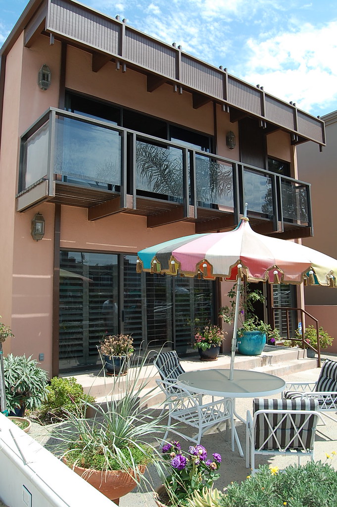
- Exterior before
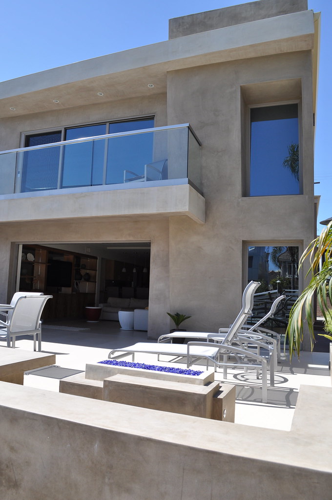
- Exterior - after
Amazingly the youngest of the Stratford siblings designed the facade and the outdoor firepit - not bad for a college kid!
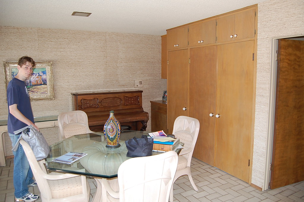
- Downstairs living room area - before
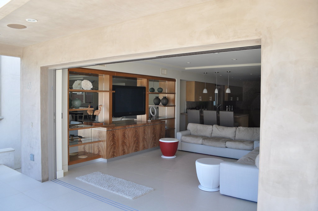
- Downstairs living room - after
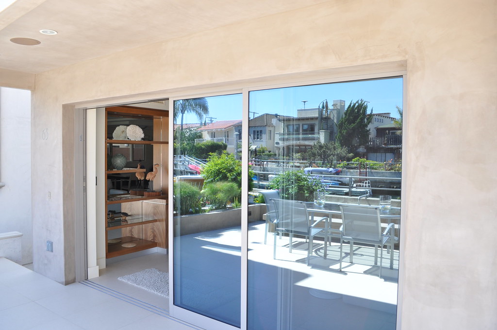
- The sliding glass doors
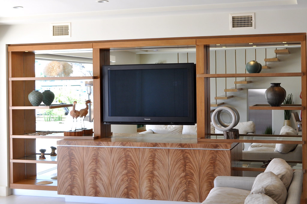
- Custom entertainment center and display
Throughout the home, they included shelving to highlight works done by the artists in the family.
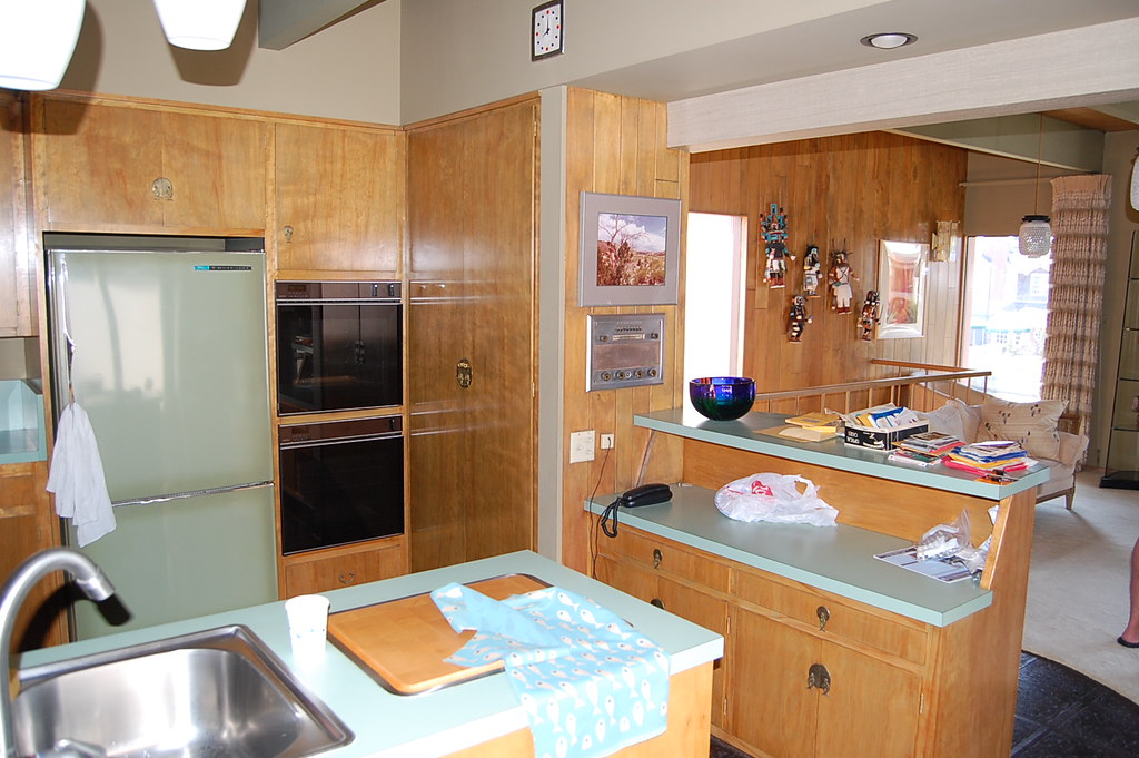
- Kitchen - before (upstairs)
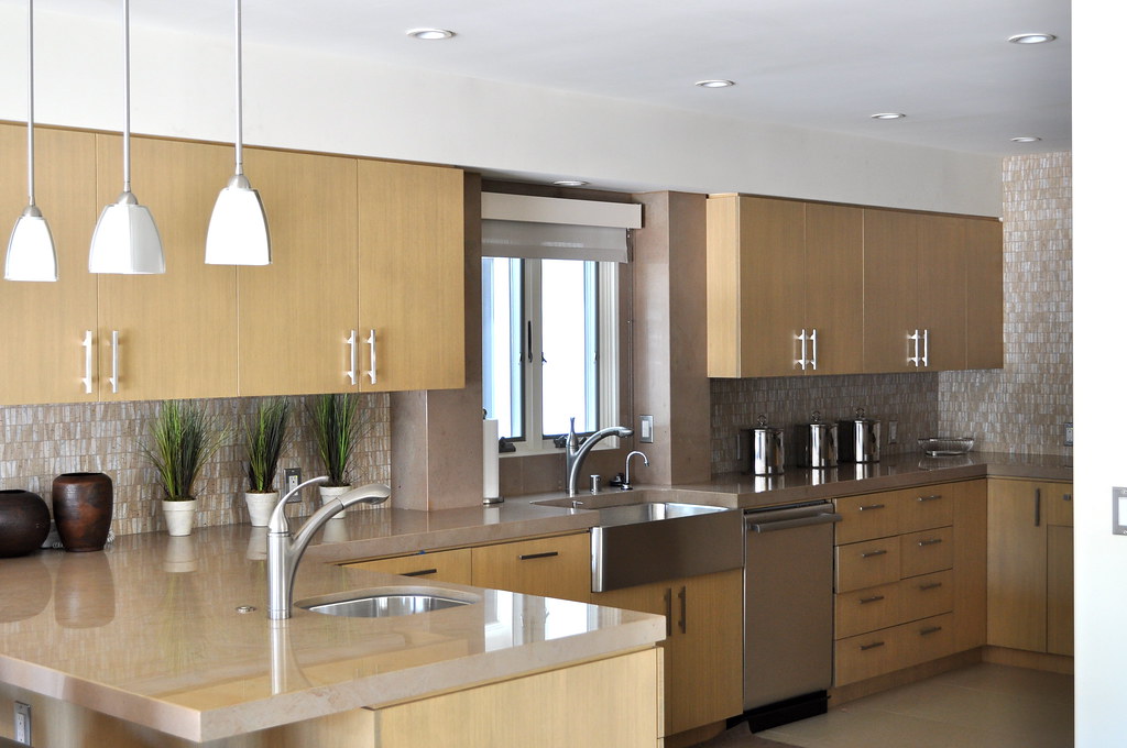
- Kitchen - after
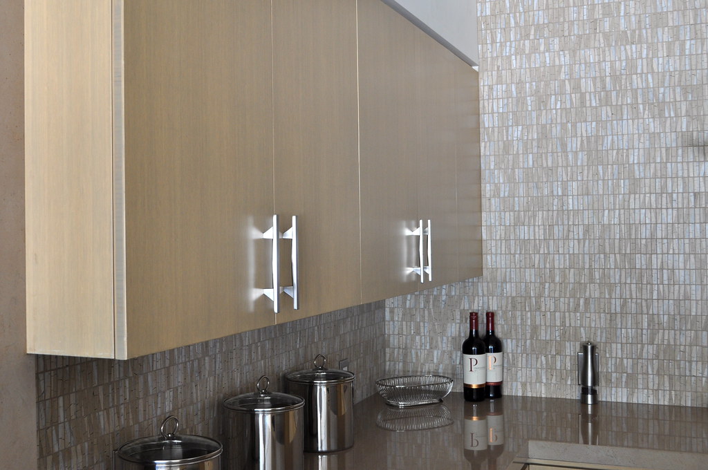
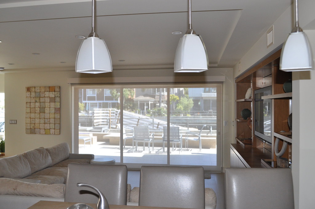
- View from kitchen out with automatic shade down, we can see out, but they can't see in.

- Dining room before
** An important disclaimer: these before photos were taken with the previous owners furniture, pretty sure it had been there since the Sixties!
[caption id="" align="aligncenter" width="398" caption="Dining area after"]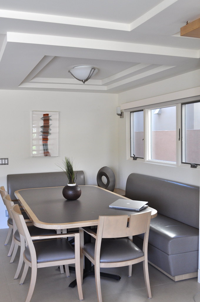 [/caption]
[caption id="" align="aligncenter" width="600" caption="The stairs - before"]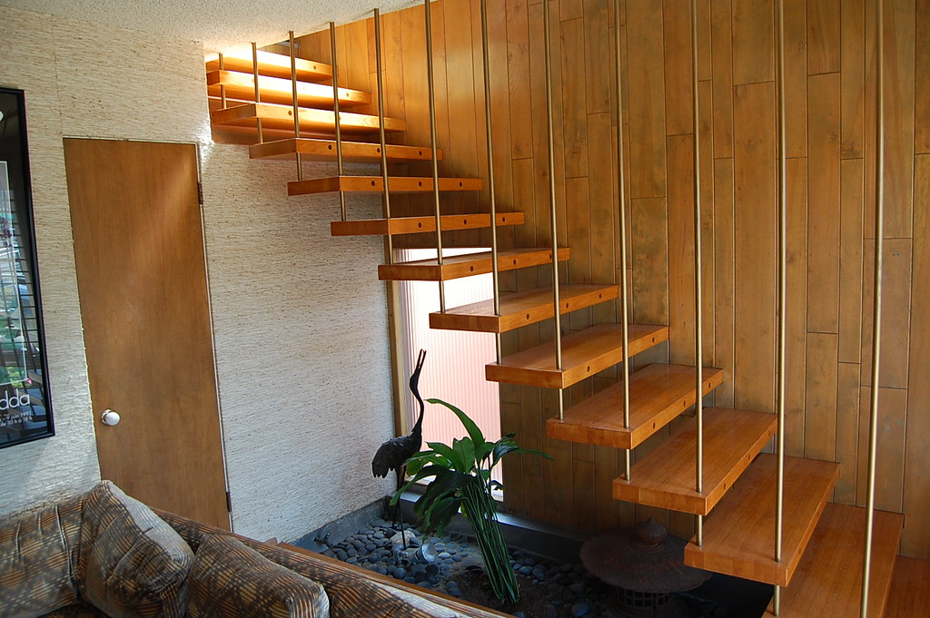 [/caption]
[caption id="" align="aligncenter" width="600" caption="Stairs after"] [/caption]
The only recognizable part of the interior! These stairs were gorgeous as is. Under the stairwell is where the fountain will go, yet again designed by Katie (she goes to UCLA, which is probably why she is so talented!)
[caption id="" align="aligncenter" width="600" caption="Stair detail"] [/caption]
[caption id="" align="aligncenter" width="600" caption="Upstairs living area before"]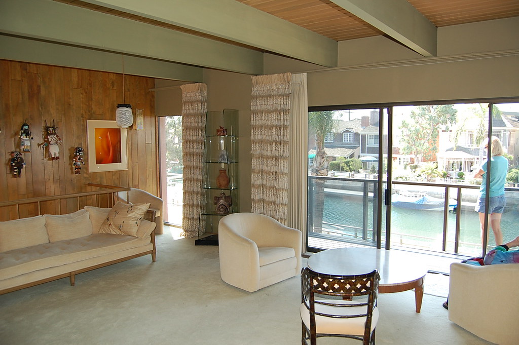 [/caption]
[caption id="" align="aligncenter" width="600" caption="Master bedroom, now in the front upstairs"]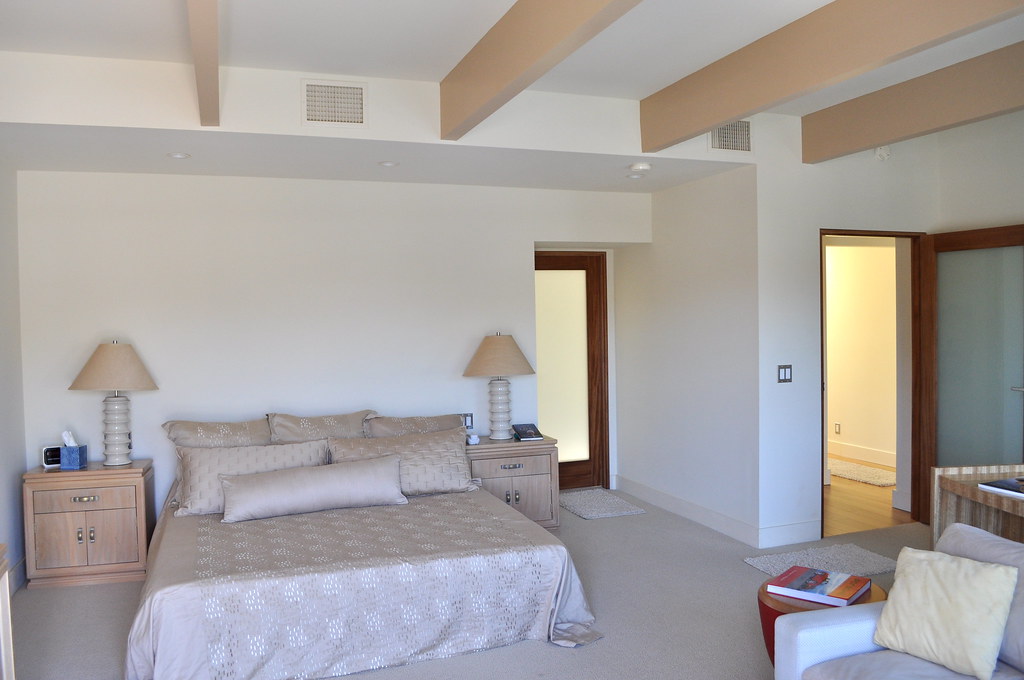 [/caption]
[caption id="" align="aligncenter" width="399" caption="Master bath before"]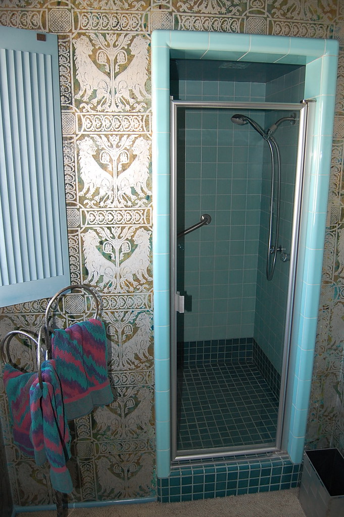 [/caption]
The above wallpaper, was very cool and kitschy, but not quite their style.
[caption id="" align="aligncenter" width="600" caption="Master bath after"]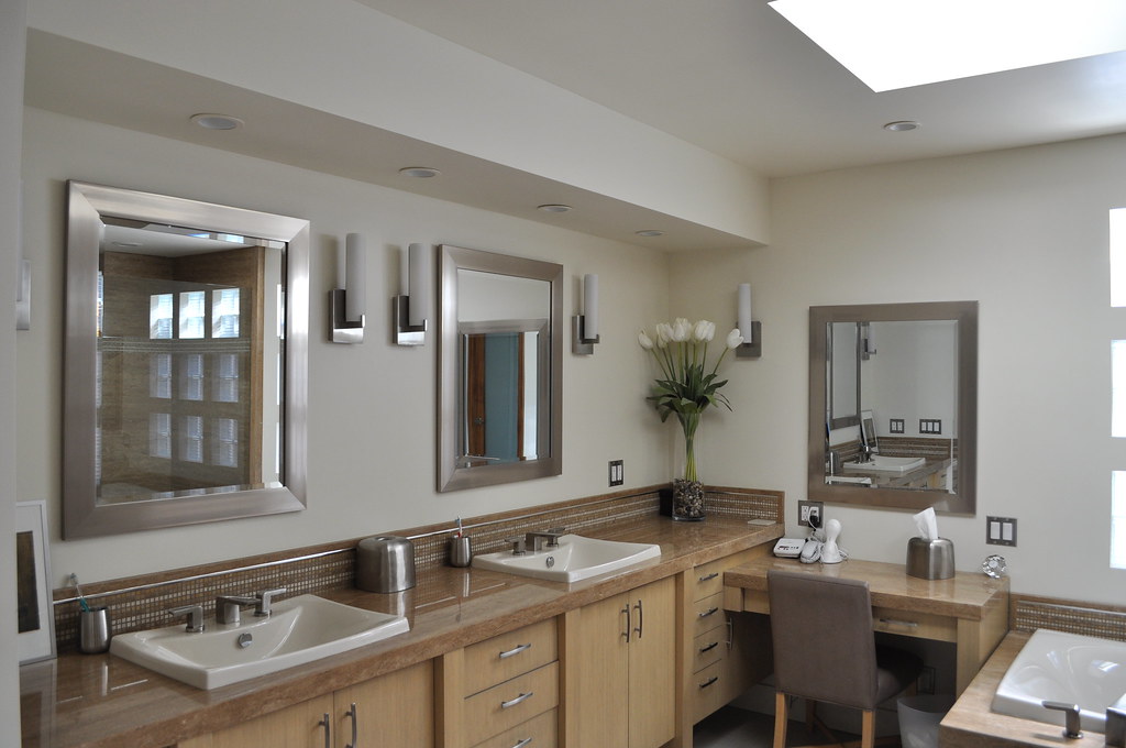 [/caption]
Oh, yes I believe I could live in this bathroom, so spacious and filled with light, like heaven!
[caption id="" align="aligncenter" width="399" caption="Other side of the bathroom, there is a huge jacuzzi tub too."] [/caption]
I know, I know this is the longest blog post ever, but I do need to include a few detail shots, since these are my favorites.
[caption id="" align="aligncenter" width="398" caption="Artwork by Jeff (top) & Katie (bottom)"]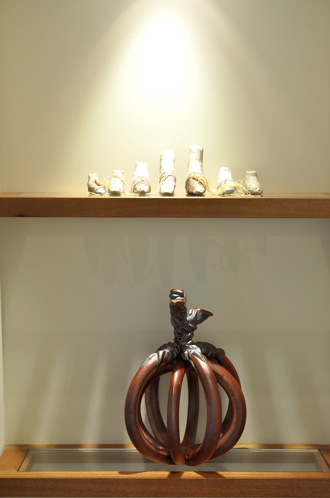 [/caption]
[caption id="" align="aligncenter" width="398" caption="More of Jeff's art"]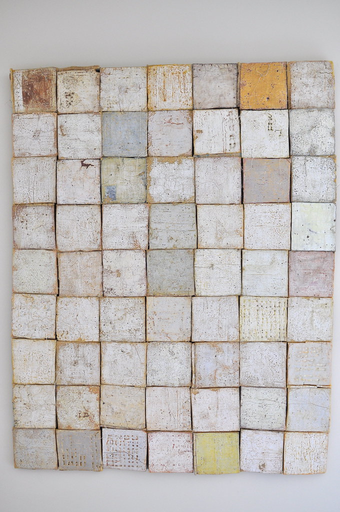 [/caption]
[caption id="" align="aligncenter" width="600" caption="Fire pit - yes, it makes a yummy s'more!"]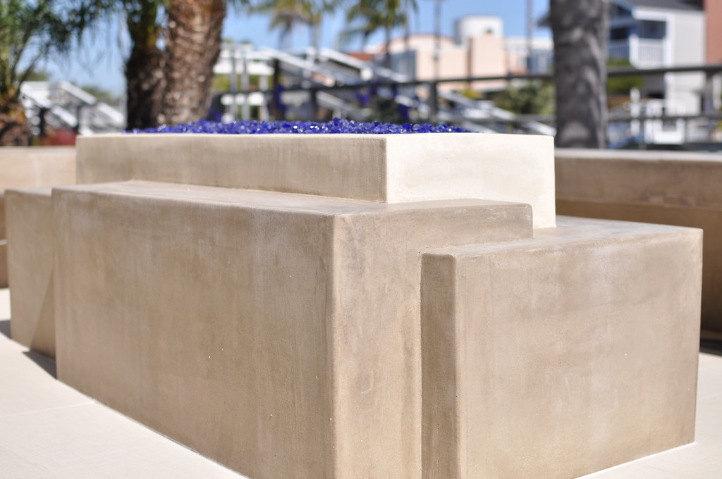 [/caption]
Now to complete the lovely home tour I take you down to the dock where you'll find the Duffy - no home on the canal is complete without one!
[caption id="" align="aligncenter" width="600" caption="Duffy!"]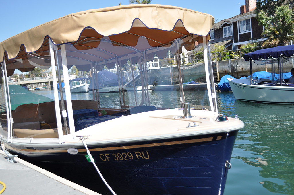 [/caption]